Sole UX/UI Designer

FLICKR
Reversed UX Case study
Project Overview
Flickr is a widely recognized platform for photo sharing and hosting, utilized by amateur and professional photographers alike to showcase their work and explore photography. This project aims to critically analyze the current user experience (UX) of the Flickr app and identify areas where both usability and visual design could be improved. The goal is to enhance the overall user experience, making content more engaging and accessible, and ensuring that the platform provides a seamless and enjoyable experience for its diverse user base.
My Role
Tools
Figma
Duration
4 weeks
Design Process
Discovery
- Observation
- Analyse
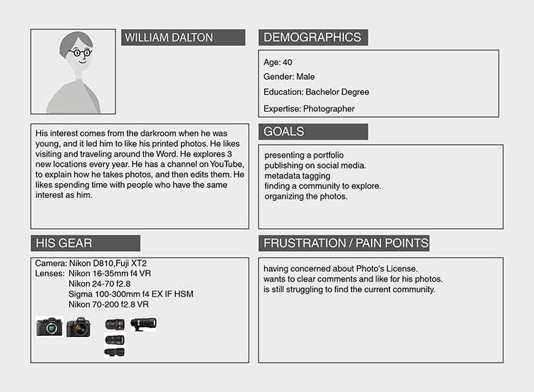
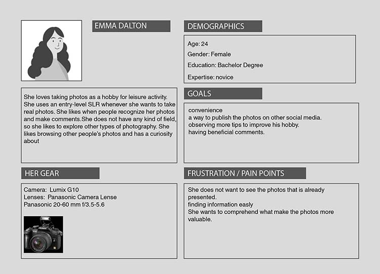
- User Persona
- Understand
- Find Problem
Ideation
- Concepts
- User Flow
- Information Architecture
Design
- UX Concept & Wireframing
- UI Concept
Delivery
- User Testing
- Prototype
- Documentation
Discovery
Observation
After a lot of research and using the app, I interpreted some key features of UX and UI that Flickr wants to have and protect. This part made me create bullet points that I should protect this point of Flickr's current mobile application overall.
- Avoid repetition of photos shared by one user, such as sharing 3 or 5 photos once.
- Protect the aspect of photos if they were shared one by one on the photo stream.
- On photo stream, the layout leads the user to focus on a photo first, then the user's name, and profile photo.
- Make appeal generally user name, profile, the number of photos shared, and the number of followers, which are iterated for other frames constantly.
- Using toggle segment for passing from sub-headers with exception of the main navigation.
- Using a similar list template for albums, and groups.
Observation
User Persona
Analyse
I analysed both the website and mobile application of Flickr in order to find the differences for both between them and to understand how to implement some features for both fields. In this part, I present some of them to benefit Flickr mobile app.
Flickr Web
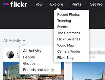
The home frame gives a lot of subheaders to browse. One of which is seeing all activities, and another is under explore nav button.
Flickr Mobile App
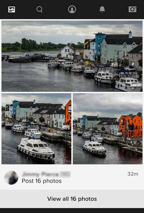
Photo steam shows only photos that the users follow.

Photos, people and groups are under search on the navigation.
Problem & Solution
Problem Statement
Flickr mobile application uses the search button on the
navigation to
explore new content, which causes less chance of discovery,
and connection of content.
The problem is
how to make the users feed with new content and increase the
connection with other users, groups, and blogs.
Solution
Reconsidering the information architecture for this necessity.
Redesigning some UI to make the user information and groups
information to make more appeal.
Ideation
Information Architecture
The information architecture of the Flickr App was observed in
order to comprehend how the user encounters new content on the
app, and where these contents are under which navigational layers.
In addition, analysing the app with these screens and every
navigation path contributed to making me realise the repetitive
components and templates that the app used on UI, which means that
the app wants to keep the eye familiar with its design elements.
The same approach for information architecture was made by just
using the name of actions that the user takes and what information
was presented under each navigation layer, which led me to
interpret the current user flow for the app.

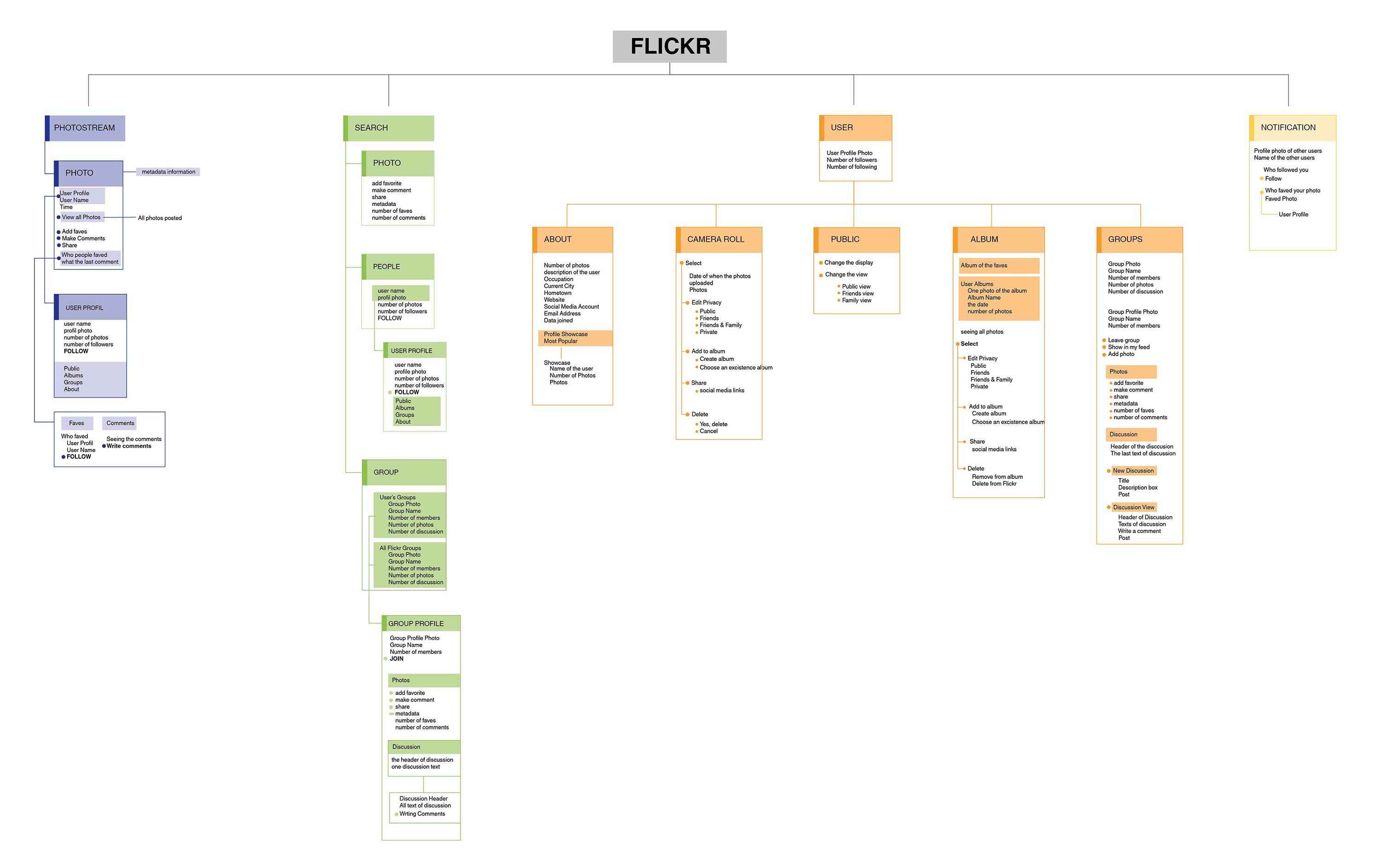
User Flow
The current User Flow
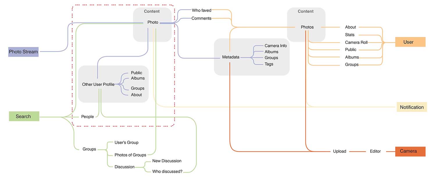
By mapping the user flow for each layer, I examined how the user can navigate the app in order to come across new content, and where this content for making the user discover more photos, groups, and discussions converged.
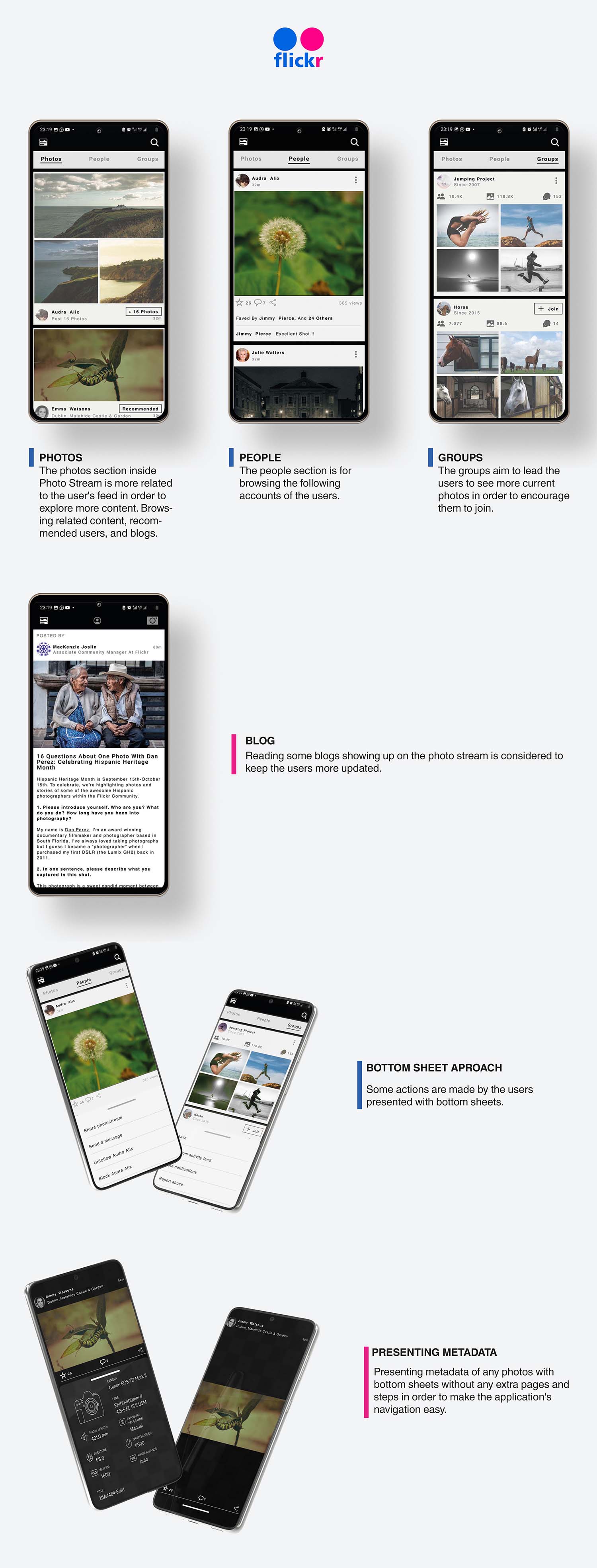
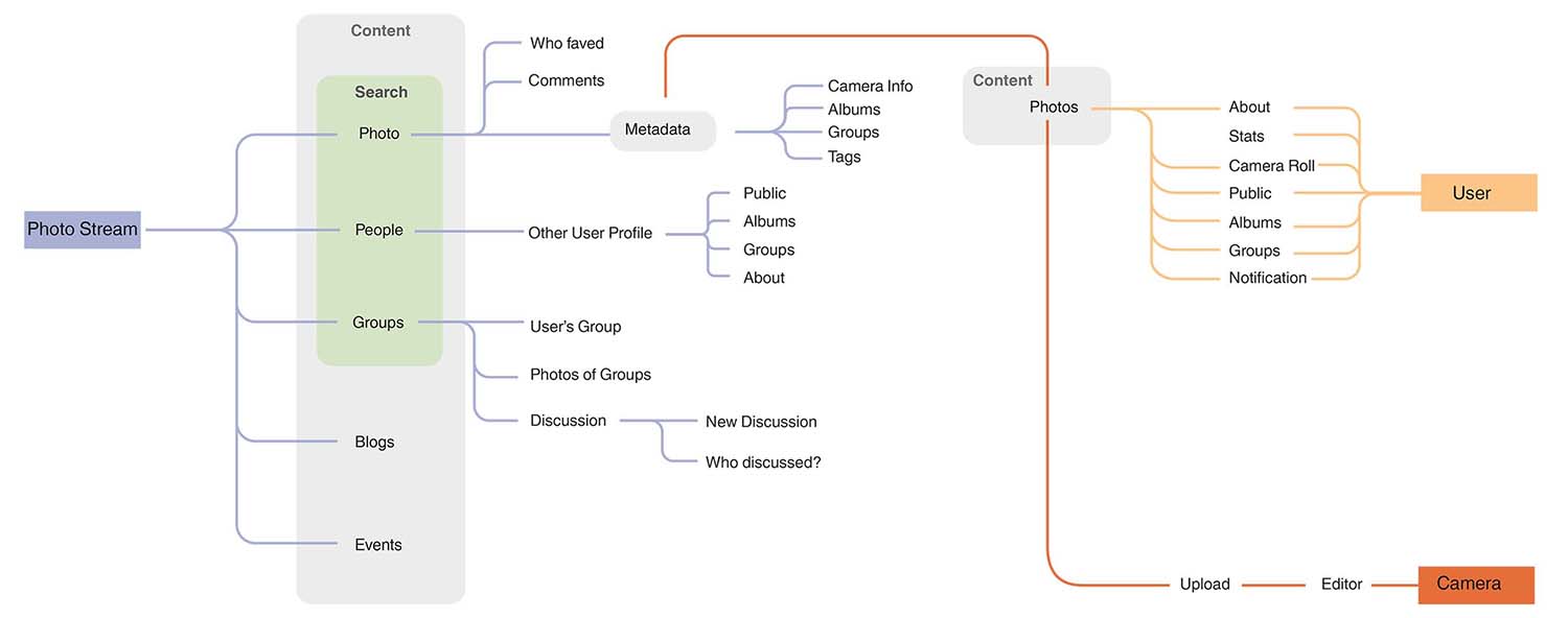
In my interpretation of making the user see more content, I considered that the search layer with its segments should be embedded in the photo stream. In that case, the content is consumed by the users more effectively. So for that reason, the navigation layers should be changed slightly affecting the photo stream and search layers.
New User Flow
Design
UX Concept and Wireframing
Navigation

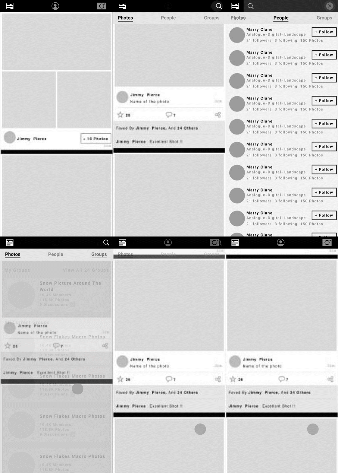
Steps of the navigation
Photo Stream, User frame, and Camera Buttons appear on the nav bar.
1-The first photo stream shows up on the app.
2- In the meantime, as to scroll down on the photo stream, the
three sub-headers that are photos, people, and groups appear
under the main navigation bar as toggle segments, which leads to
disappear the user button and camera button on the main
navigation, and also to bring search button on the main
navigation bar.
3- As tabbing the search button, the search filter is going to
be active for every subheader, which are photos, people, and
groups.
4-Scrolling up is going to lead to disappear those sub-headers
that are sub-header of stream photo and search button on the
navigation in order to bring back the user and camera button on
the navigation.
Photo Stream & Wireframing Process
Flickr - Photo Stream- Original
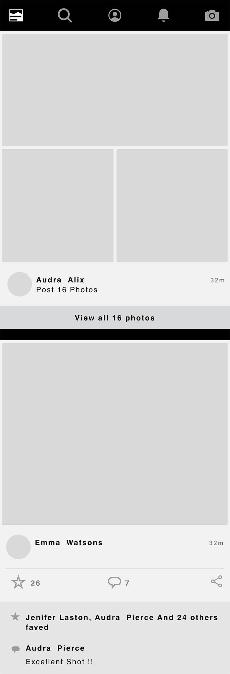
Flickr - Photo Stream- V01
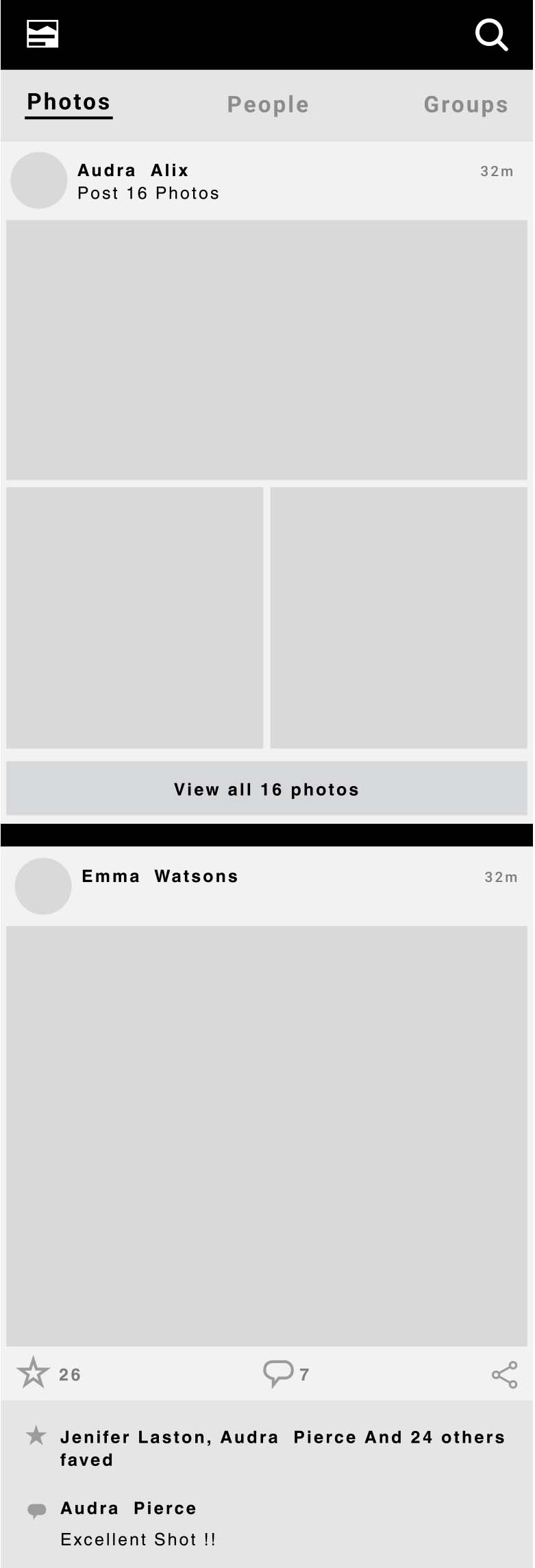
changed the layout slightly
Flickr - Photo Stream- V02

view 16 photos- +16 photos
removed small icons for faved and comment
added recommended
added blog
Flickr - Photo Stream- V02-Hi fi

Photo Stream with Subheaders
Flickr - Photo Stream/Photos

Flickr - Photo Stream/People
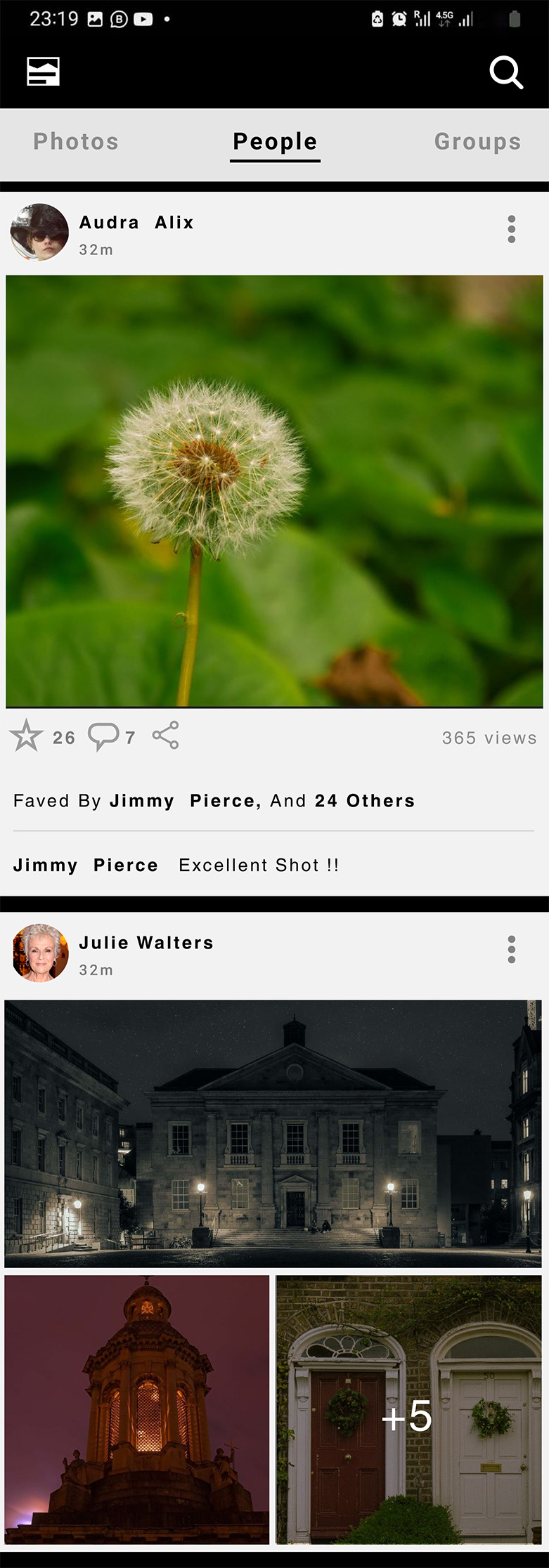
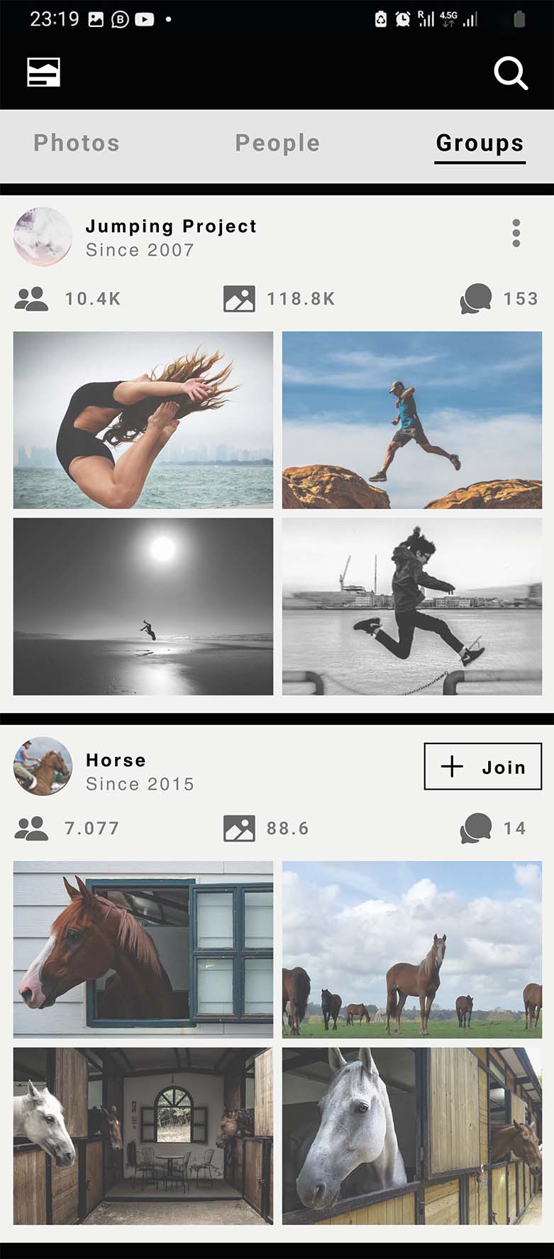
Flickr - Photo Stream/Groups
Flickr - Photo Stream/Blog

Poster
