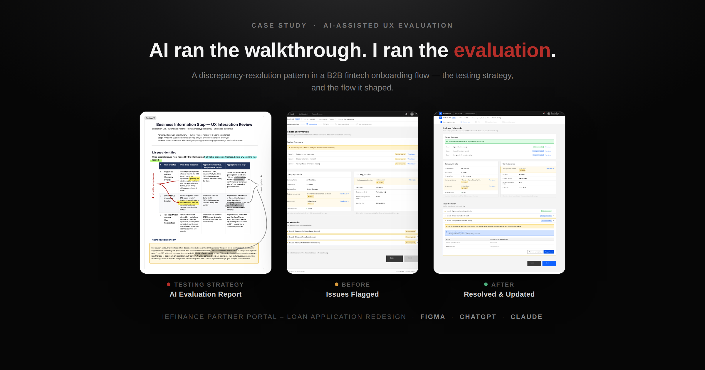
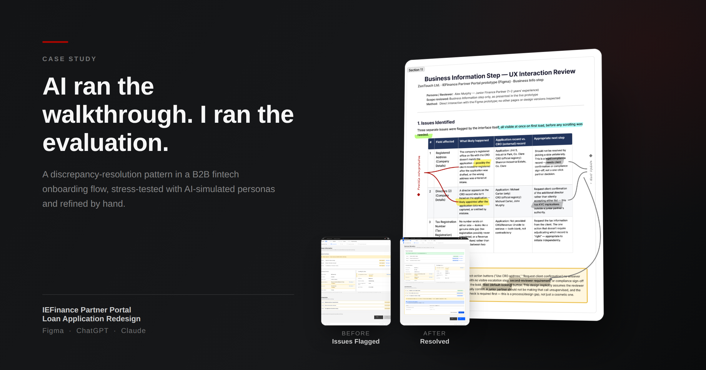
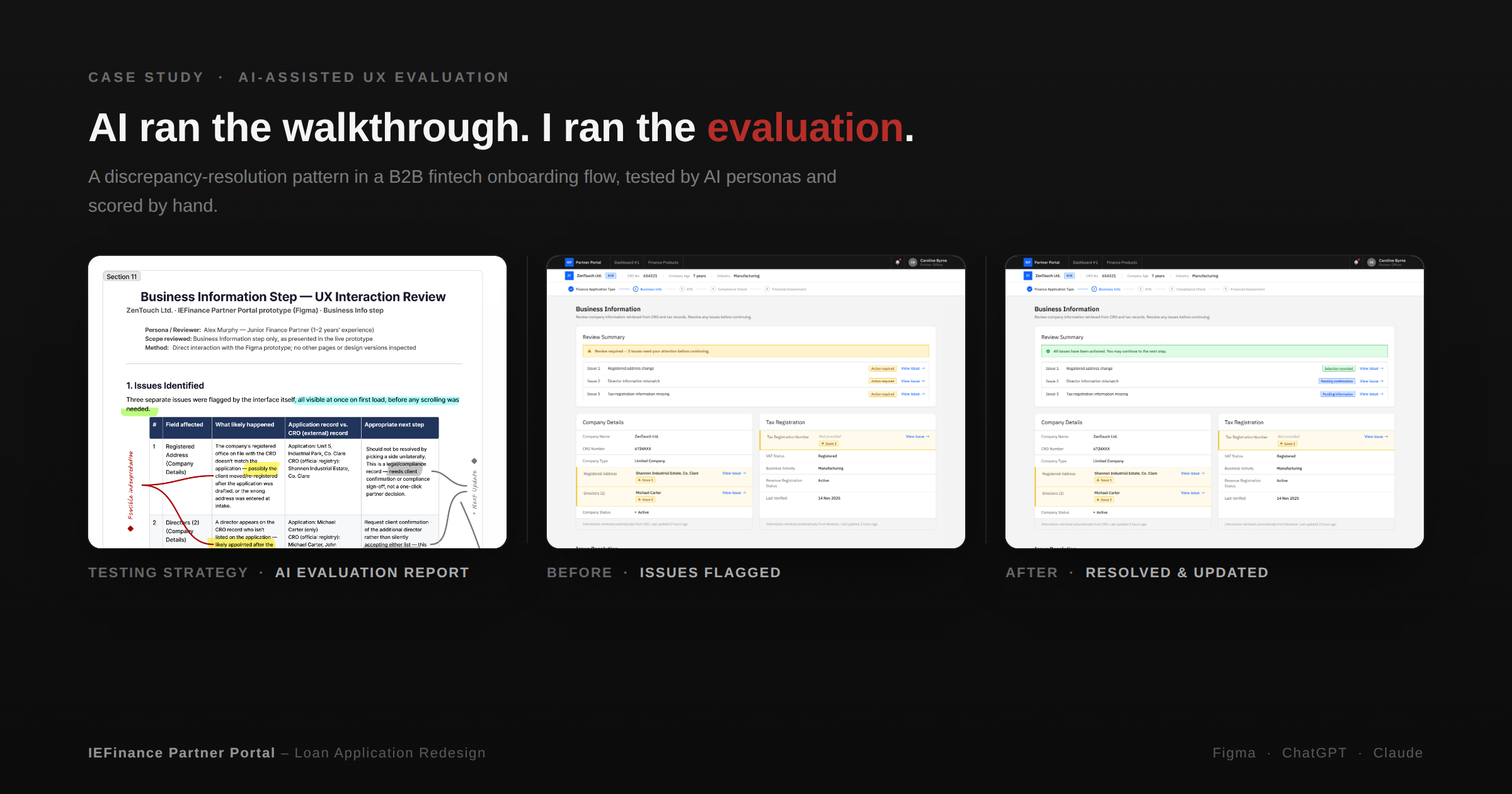
Case study cover — AI evaluation report, spotlight layout Case study cover — AI evaluation report, angled hero layout Case study cover — report, before and after, split grid layout

Testing discrepancy resolution patterns

I evaluated how effectively finance partners could notice mismatched data retrieved from CRO and other external sources, understand why it had been flagged, and identify an appropriate next action.

Insight

What was not yet known

I did not have access to a real operational example showing whether partners were authorised to select an address themselves.
My initial assumption was that the partner would need to contact the client and ask them to confirm which information was correct.

Goal
  1. Help partners understand the data discrepancy.
  2. Enable them to initiate the resolution process easily within the workflow.
  3. Guide them to continue the application with confidence.

What was tested and how?

AI-assisted, persona-based evaluation
Persona used throughout the evaluation
Alex Murphy
Alex Murphy
Junior Finance Partner
Experience:
1–2 years
Knowledge level:
Understands basic loan processing but has limited confidence interpreting CRO, Revenue and compliance discrepancies independently.

Alex has 1–2 years of experience and limited confidence when interpreting discrepancies between CRO records and client-provided information. I selected Alex because a pattern that works for a less-experienced partner should provide sufficient guidance without relying on specialist knowledge.

The same persona and application scenario were maintained across all three rounds to make the findings easier to compare.


ROUND 1 — STATIC CONCEPT SCREENING
Round 1 — Comparing Three Patterns with One Issue

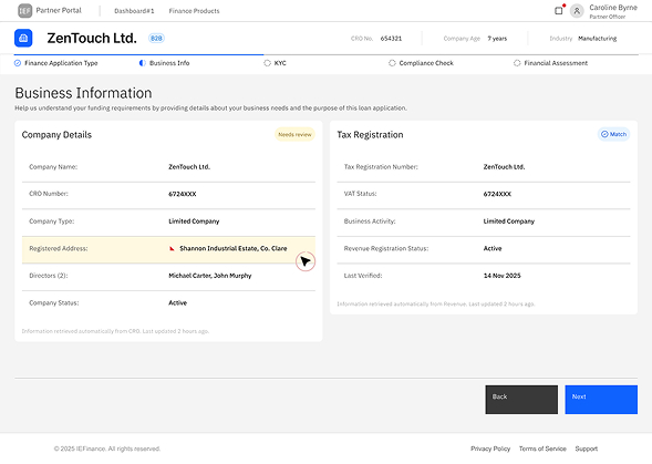
Three interaction patterns were initially tested with one registered-address mismatch.

Research question

Which interaction pattern communicates a single discrepancy most clearly without unnecessarily interrupting the application?

METHOD — CHATGPT STATIC-IMAGE EVALUATION

Method — ChatGPT persona-based evaluation

I uploaded static images of the three interface concepts to ChatGPT, together with Alex’s persona, the application scenario and a consistent set of evaluation questions. ChatGPT examined the visible interface states from Alex’s perspective and evaluated how clearly each version communicated the discrepancy and the required response.

EVALUATION CRITERIA

ROUND 1: Evaluation criteria

To compare how effectively each interaction pattern helped finance partners notice a single data discrepancy, understand its context, identify the next action and continue the application with confidence.
ChatGPT was asked:

  1. Would you notice the issue?
  2. Would you understand which field caused the issue?
  3. Would you know what action to take?
  4. What would confuse you?
  5. How confident would you feel about understanding what to do next?

Each concept was then scored from 1 to 5 against:

  • Discoverability
  • Context clarity
  • Action clarity
  • Workflow continuity
  • Perceived confidence
PROTOTYPES — THREE CONCEPTS

PROTOTYPE VERSIONS

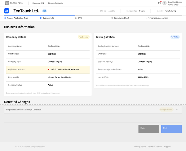
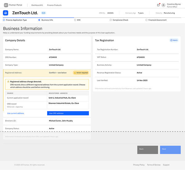
Version A — business information screen Version A — modal resolution screen
Version A Modal Resolution

Prototype versions

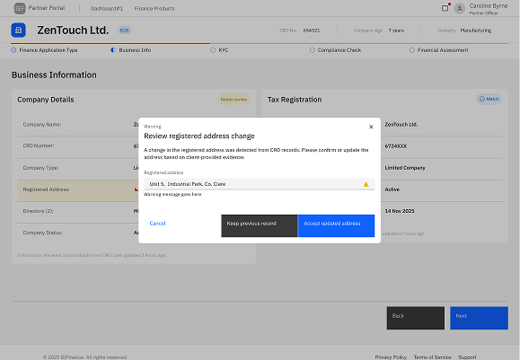
Version A — Modal Resolution

Why I explored this pattern

I explored a modal because its strong attention capture makes a critical discrepancy difficult to miss. The focused overlay brings the issue, data comparison and available actions into immediate view without requiring scrolling. I included it to assess whether this visibility and focus would outweigh the interruption and loss of surrounding page context.

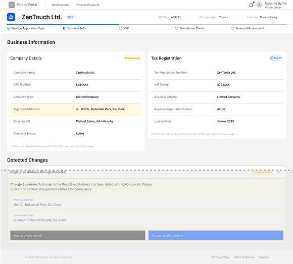
Version B — business information screen Version B — standalone accordion screen
Version B Standalone Resolution Accordion

Prototype versions

Version B — Standalone Resolution Accordion

Why I explored this pattern

I explored a standalone accordion because it keeps the user within the existing page while providing expandable space for discrepancy details, data comparison and resolution actions. It preserves the surrounding business information for reference and could support multiple discrepancies as separate accordion items without interrupting the workflow.

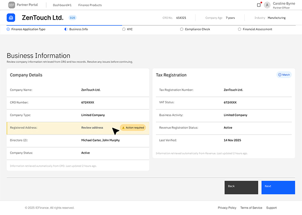
Version C — business information screen Version C — embedded accordion screen
Version C Embedded Resolution Accordion

Prototype versions

Version C — Embedded Resolution Accordion

Why I explored this pattern

I explored an embedded accordion to connect the discrepancy directly to the affected record. Expanding the issue in context allows the user to compare the existing and retrieved information and take action without searching elsewhere on the page. The progressive disclosure also keeps resolution details hidden until they are needed.

KEY FINDINGS

ROUND 1: findings

Version A made the discrepancy noticeable, but the modal interrupted the application flow and separated the resolution task from the affected information.

DESIGN DECISION — REMOVE VERSION A
Round 1 Decision

Version A was eliminated from further evaluation. Versions B and C progressed to Round 2.


ROUND 2 — MULTI-ISSUE STRESS TEST
ROUND 2 — Stress-testing B and C with multiple issues

Three interaction patterns were initially tested with one registered-address mismatch.

Research question

How effectively do Versions B and C help a junior finance partner identify, understand and manage multiple discrepancies within the same application step ?

METHOD — CLAUDE INTERACTIVE WALKTHROUGH

Method: Claude persona-based walkthrough of interactive prototypes

I opened the interactive prototypes in the browser and used the Claude browser extension to evaluate each version. Claude was provided with Alex’s persona, the multi-issue application scenario and a consistent set of tasks and evaluation questions.
Claude adopted the defined persona, navigated each prototype and evaluated the interaction while progressing through the discrepancy-resolution flow. The same instructions and scenario were used for both versions to support a consistent comparison.
This was an AI-simulated evaluative walkthrough rather than testing with human participants.

TEST CONDITION — TWO PROTOTYPES, THREE DISCREPANCIES

MULTI-ISSUE SCENARIO

  • Registered-address change
  • Director-information mismatch
  • Missing tax information
EVALUATION CRITERIA

ROUND 2: Evaluation criteria

Claude evaluated whether Alex could:

  1. Notice that multiple discrepancies required attention.
  2. Identify all affected fields or records.
  3. Understand what was different in each case.
  4. Determine the appropriate action for each issue
  5. Navigate between unresolved issues.
  6. Recognise which issues had been completed.
  7. Continue the wider application workflow with confidence.

The prototypes were evaluated against:

  • Discoverability of multiple issues
  • Connection between each issue and its affected field
  • Information clarity
  • Action clarity
  • Issue navigation
  • Visual manageability
  • Progress visibility
  • Perceived confidence

Important distinction

Round 1 evaluated basic usability and comprehension.

Round 2 evaluated scalability and issue management.

PROTOTYPES — VERSIONS B AND C

ROUND 2: Two AI walkthroughs, evaluated by me

AI Operates

Version B Standalone Resolution Accordion

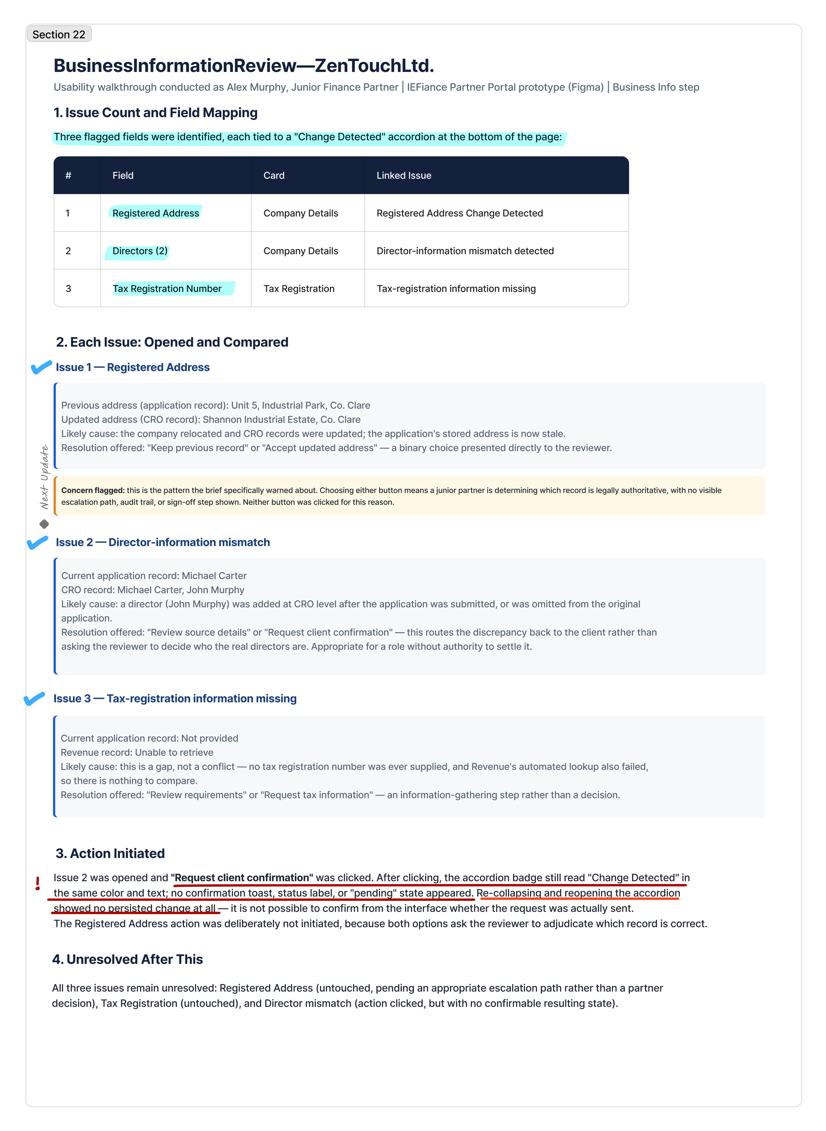
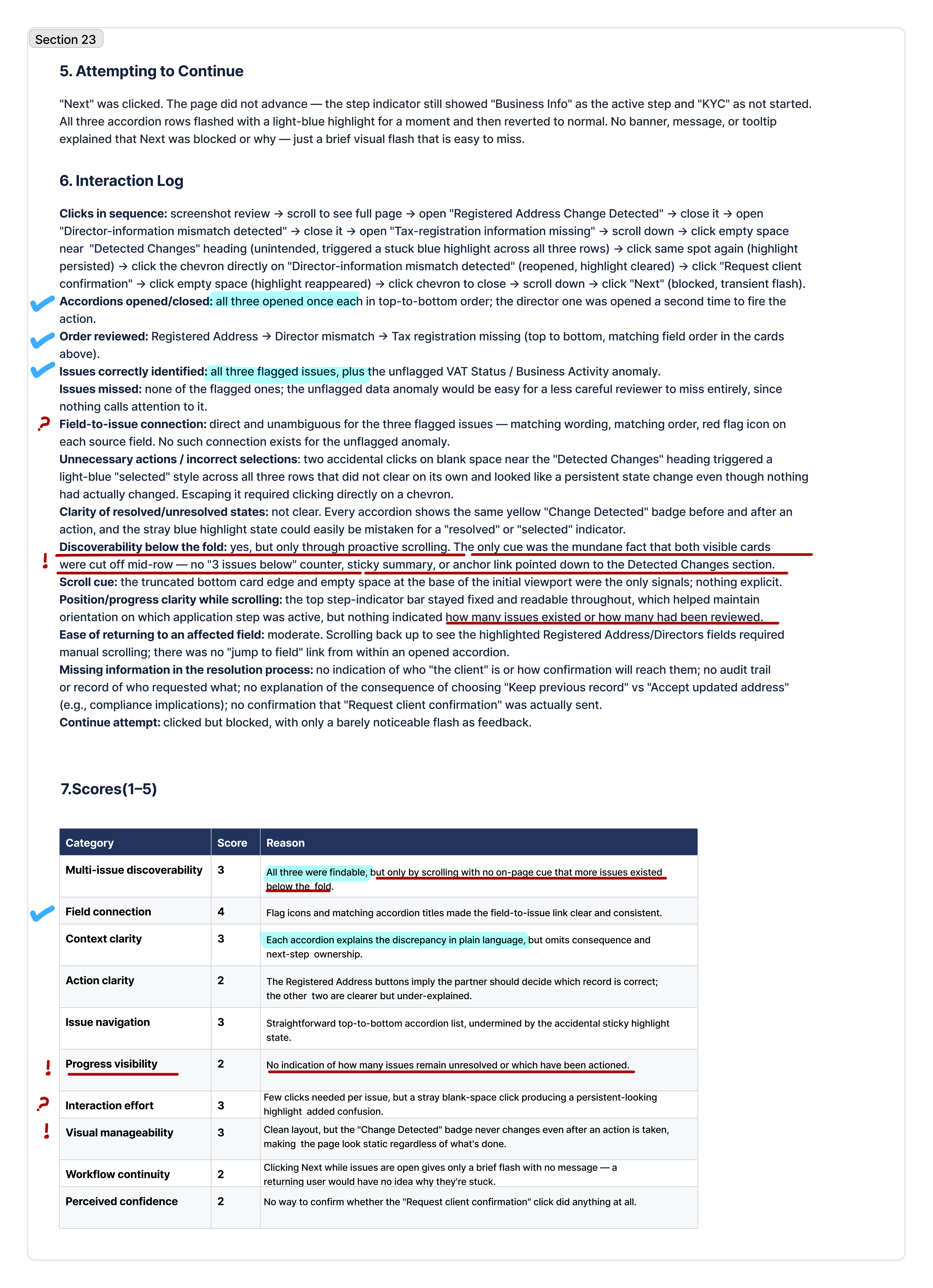
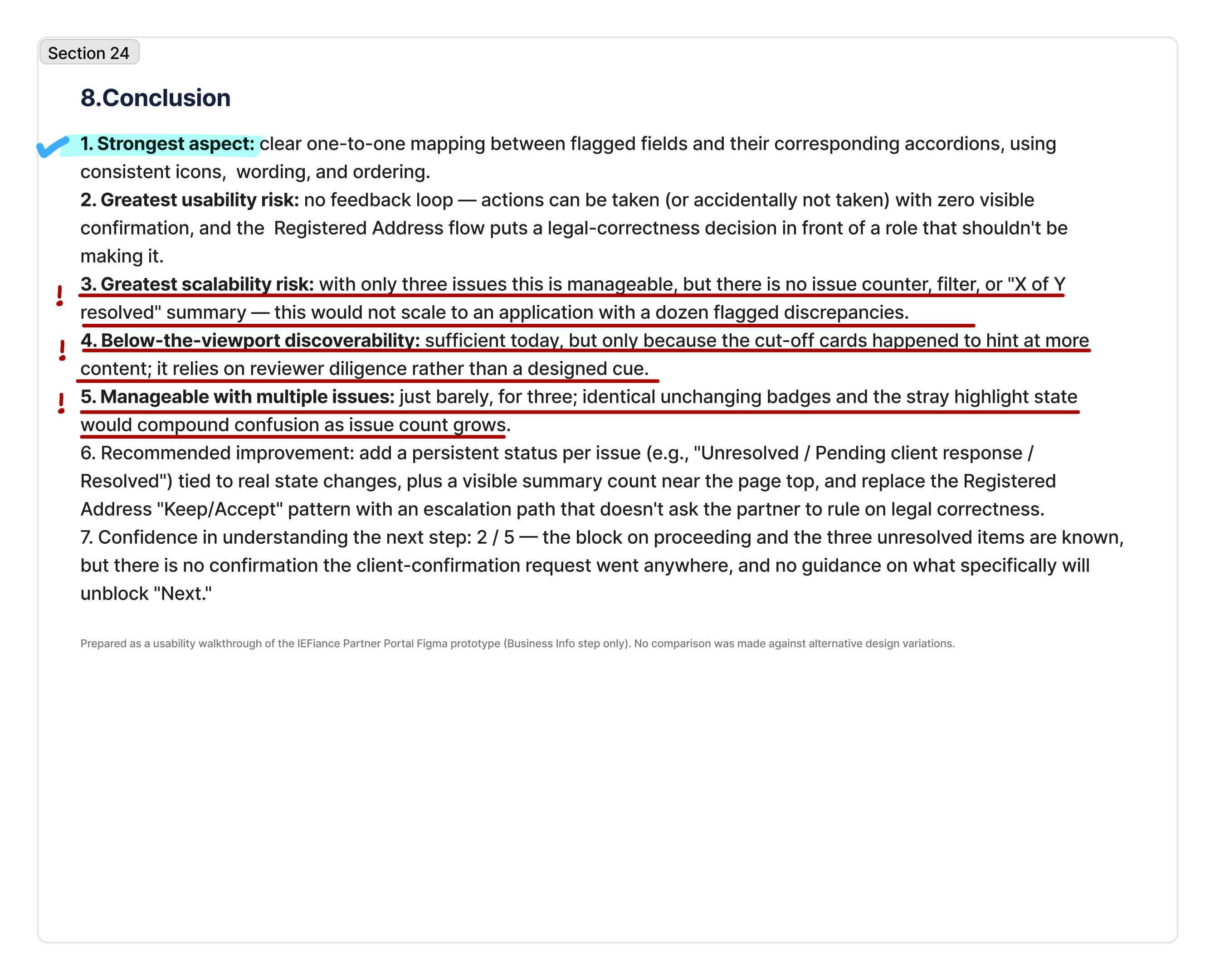
AI Report — Version B

Preview of the AI evaluation report

AI Report and My Evaluation

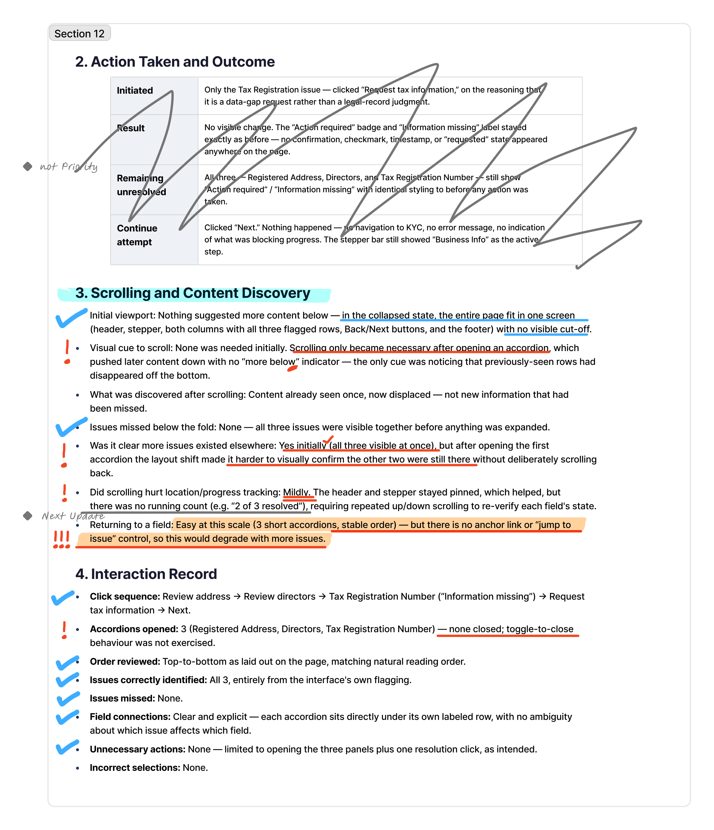
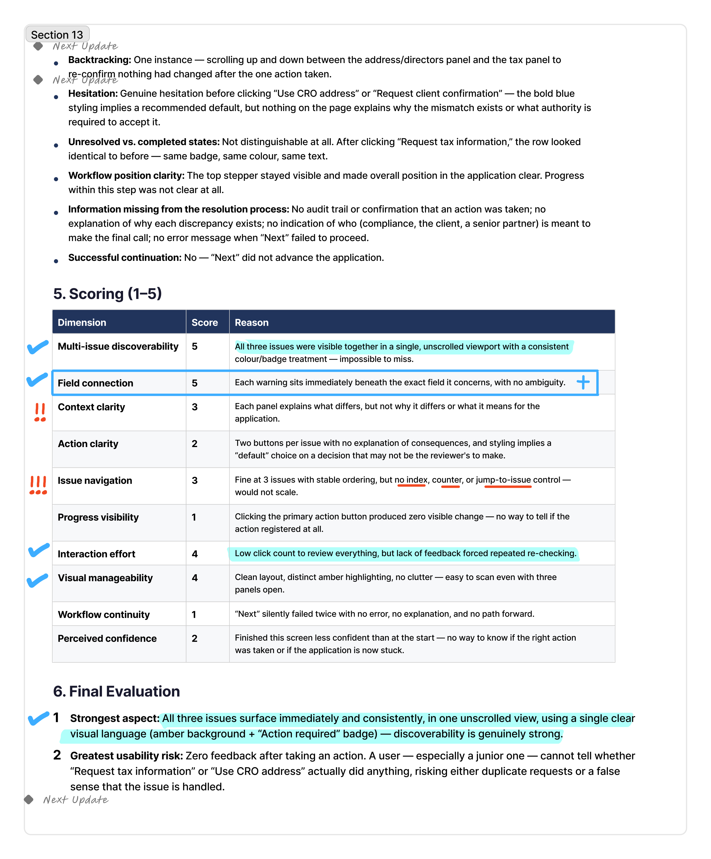
AI report — page 1 of 3
1 / 3
AI report — page 2 of 3
2 / 3
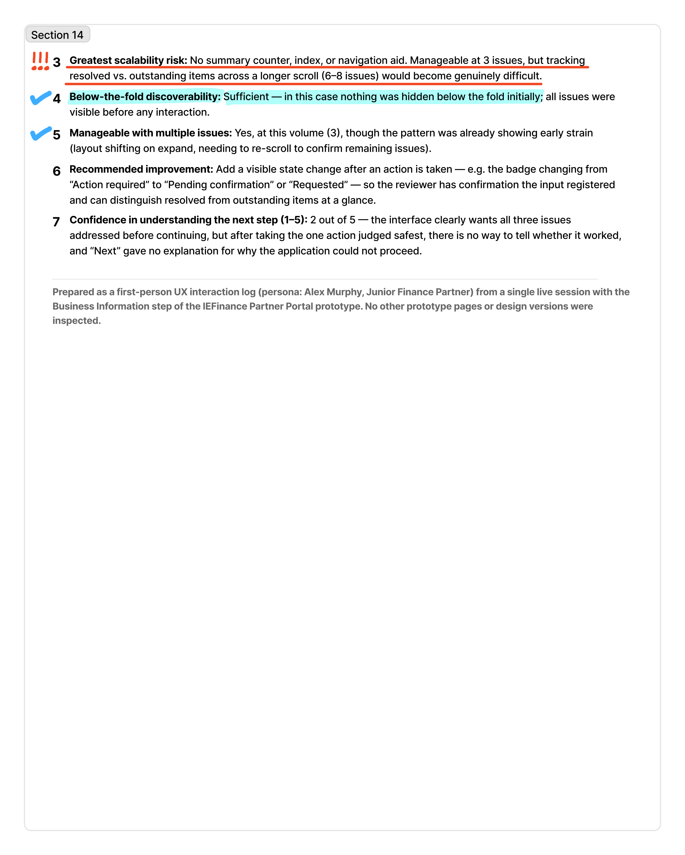
AI report — page 3 of 3
3 / 3

AI Operates

Version C Embedded Resolution Accordion

AI Report + My Evaluation

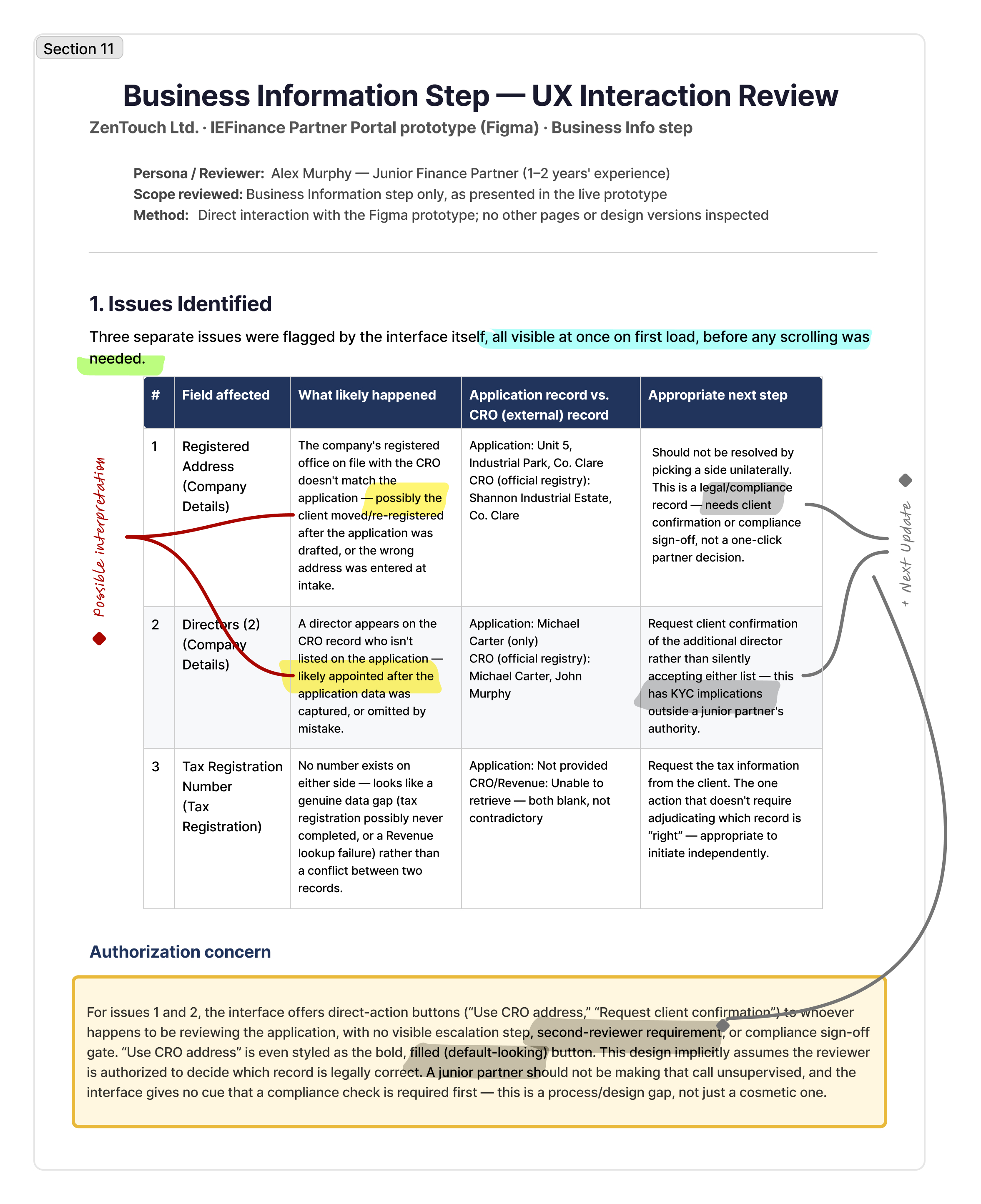
AI Report — Version C

Preview of the AI evaluation report

AI Report and My Evaluation

AI report — page 1 of 4
1 / 4
AI report — page 2 of 4
2 / 4
AI report — page 3 of 4
3 / 4
AI report — page 4 of 4
4 / 4
COMPARATIVE RESULTS

ROUND 2: COMparıson

Criterion Version B Version C
Multi-issue discoverability3/55/5
Field connection4/55/5
Context clarity3/53/5
Action clarity2/52/5
Issue navigation3/53/5
Progress visibility2/51/5
Interaction effort3/54/5
Visual manageability3/54/5
Workflow continuity2/51/5
Perceived confidence2/52/5
KEY FINDINGS

ROUND 2: fındıngs

Both patterns communicated that multiple discrepancies were present, but they supported resolution differently.

Version B — Standalone Resolution Accordion

  • Provided more space for explanations and resolution guidance.
  • Allowed issue details to remain available without replacing the application page.
  • Required movement between the side panel and the affected records.
  • Sometimes weakened the visible connection between an issue and its source field.

Version C —Embedded Resolution Accordion

  • Connected each issue more directly to its affected record.
  • Supported issue-by-issue resolution within the application context.
  • Reduced movement between separate interface areas.
  • Became visually denser when several discrepancies appeared simultaneously.

The interactive walkthrough also revealed issues that could not have been assessed reliably from static images, including:

  • Movement between discrepancies
  • Visibility of unresolved issues
  • Feedback following an action
  • Continuity when returning to the wider application
  • The effort required to complete the resolution sequence
DESIGN DECISION — IMPROVE VERSION B
Round 2 Decision

The results did not support adopting either version without modification. I used the Round 2 findings to improve the prototypes, focusing on:

  1. Strengthening the connection between issues and affected records
  2. Clarifying the next action for each discrepancy
  3. Improving feedback after an issue was addressed
  4. Making unresolved issues easier to track
  5. Reducing visual competition between multiple alerts

ROUND 3 — IMPROVED PROTOTYPE EVALUATION
Round 3 — Evaluating the improved interactive prototype

Research question

Did the improved version address the interaction problems identified in Round 2 while helping the simulated persona identify, understand and resolve multiple discrepancies within the wider application workflow ?

METHOD — CLAUDE INTERACTIVE WALKTHROUGH

Method: Claude persona-based walkthrough of interactive prototypes

I repeated the persona-based walkthrough method used in Round 2. I opened the improved Version B prototype in the browser and used the Claude browser extension to navigate and evaluate the discrepancy-resolution journey.

    Claude was provided with:

  1. Help partners understand the data discrepancy.
  2. Enable them to initiate the resolution process easily within the workflow.
  3. Guide them to continue the application with confidence.
Claude adopted Alex’s persona, navigated the prototypes and evaluated the experience while attempting to identify and resolve each discrepancy.

Using the same method, persona and scenario allowed me to examine whether the changes made after Round 2 improved the experience under comparable conditions.

Using the same method, persona and scenario allowed me to examine whether the changes made after Round 2 improved the experience under comparable conditions.

PROTOTYPE — IMPROVED VERSION B

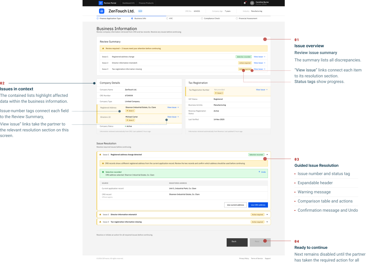
Round 3 — Improved Version B: Discrepancy-resolution workflow

Only one prototype was evaluated during this round: the improved Version B.

Improved Version B — discrepancy-resolution workflow, showing the review summary, highlighted fields and guided issue resolution
Figure 3. Improved Version B, showing one recorded selection and two issues still requiring action.
  1. Issue overview: The summary lists discrepancies, shows their status and links to each resolution section.

  2. Issues in context: Highlighted fields and issue-number tags connect affected data to the summary and resolution sections.

  3. Guided issue resolution: Expandable accordions explain discrepancies, compare source records and provide actions with confirmation feedback.

  4. Ready to continue: Next remains disabled until the partner has taken the required action for all three issues.

EVALUATION RESULTS

ROUND 2: COMparıson

Evaluation area Criterion Score
Issue comprehension Multi-issue discoverability 4/5
Field connection 4/5
Context clarity 5/5
Resolution experience Action clarity 3/5
Issue navigation 4/5
Progress visibility 5/5
Interface experience Interaction effort 4/5
Visual manageability 4/5
Perceived confidence 3/5
End-to-end experience Workflow continuity Not assessed*

*Workflow continuity could not be fully assessed because the prototype ended at this application step. The Next button was displayed but was not connected to the subsequent workflow.

KEY INTERACTION FINDING

Indicated strengths

  1. The Review Summary clearly communicated that three issues required attention.
  2. Issue numbers connected the summary, affected fields and corresponding resolution sections.
  3. Comparison tables clearly distinguished application data from CRO and Revenue records.
  4. The primary resolution actions produced understandable confirmation states.
  5. Status labels changed from Action required to more specific states, including Selection recorded, Pending confirmation and Pending information.
  6. Progress visibility made it possible to recognise which issues still required attention.
  7. The Next button became available after an action had been initiated for every issue.
KEY INTERACTION FINDING

Key finding

The improved hybrid pattern provided strong multi-issue discoverability, field connection and progress visibility. Claude identified all three discrepancies, connected them to the affected records and moved between their resolution sections without losing the wider screen context.

The issue numbering, status changes and progress indicators supported continuity across the three discrepancy-resolution tasks. Action clarity remained less consistent because some issue types required more explicit guidance about the appropriate response.

Claude attempted to use controls that were outside the functional scope of the prototype. These interactions were unrelated to the within-screen workflow being evaluated and were excluded from the findings.

Method limitation

Method limitation

The interactive prototype was designed to evaluate the discrepancy-resolution workflow within one screen. It did not include every secondary control or navigation to subsequent application steps.

Claude occasionally attempted interactions beyond this defined scope. Any resulting lack of response was caused by prototype fidelity and was not treated as evidence about the within-screen workflow or the proposed design.

Conclusion and next steps

Across three rounds, AI-assisted evaluation helped narrow three concepts to one improved interactive prototype. The final walkthrough indicated strong issue discoverability, field connection and progress visibility, while action clarity still required improvement.

These findings are directional rather than evidence of real user behaviour. The next step is to test the prototype with finance partners and use their feedback to guide the final iteration.